
Friday 18 December 2015
Thursday 10 December 2015
Photo planning

Location- Central Drama
Photo editing software- Fireworks or Photoshop
Lighting- soft key
People involved- Jack, Holly and Luija
Costume- Jeans, Green jacket, blouse
Props- Musical instruments
Photo schedule- during the week- Wednesday
Camera angles- low, high, tilted, close up, mid shot
what is it for- double page spread, contents page and front cover
Location- Sutton Town Center
Photo editing software- Fireworks or Photoshop
Lighting-none
people involved- myself
Costume- Jeans, Checkered shirt, Black jacket, Canvas shoes
Props- none
Photo Schedule- Weekend, Saturday or Sunday
Camera angles- Low angle, High angle
what is it for- Double page spread.
Monday 7 December 2015

Tuesday 24 November 2015
Pop Masthead Designs

Monday 23 November 2015
House style

House style
House style is linked to the branding of the magazine and how it makes it unique for their target audience. This includes layout and structure. To create the individual house style of a magazine they use masthead, colours and positioning of common conventions. For example, magazines sometimes have images over their masthead as their brand is commonly recognized by the reader regardless.
The house style that is used in NME's magazines is that the brand logo is always located in the top left corner and the colours or design will change depending on the event or colour used in the background. The main colour for the logo is red. An example is the Christmas issue with Simon Cowell on the front that has the logo in the corner. It is red but it looks more glossy and has snow on top of the letters. This suits the theme of Christmas but sticking close to the music. The celebrities in the images are mostly located in the middle but one or two are located of too the side. The text colour on all of these magazines have the colour red or white and rarely have any other colour. This means that the brand have a colour scheme of red and white. To the audience, this makes it more clear to read but stands out from the rest of the cover meaning less stress in trying to read. There is no add pictures on any of the magazine except for one which is located in the top right of the middle magazine with "Joel starts over" as it's coverline. The main coverline is mainly located in the middle but can be on the sides but if the story is a big one it will always be in the centre of the cover.
Friday 20 November 2015

Wednesday 11 November 2015

Tuesday 10 November 2015


Monday 9 November 2015
Music Genres
Music Magazine genres


- Pop
- Rock
- Blues
- Heavy Metal
- Classical
- Disco
- Jazz
- Hip-Hop
- House
- Country
- Techno
- Rap
Niche Audience
Is a small selected audience with a very unique interest. For example Music or Game genre
The music type that I have selected is Pop because I listen to a lot of pop songs as it's catchy and great to listen too. Plus this type has a massive fan base spanning from singles to groups. Most of the artists are adored by the public and that the songs can be influencing. Pop has some big idols over the years that have changed the people see the world. This is what interests me and I like to know more on the history.

Friday 6 November 2015

Thursday 5 November 2015

Wednesday 4 November 2015
My School Magazine evaluation

evaluation
In what ways does your media product use, develop or challenge forms and conventions of school magazines?
The conventions of the cover that I used were a masthead, straplines, coverlines, main image and anchorage text. These are some of the elements that have created my front cover design. I used some of fireworks features like shadow to make the text stand out from the image. I rotated the coverline to give it effect. I added more pictures to make the cover more attractive to my audience. I edited the logo so that it doesn't have a white background.
Who would be the audience for your media product?
My audience is students year 7 to 13 because the main picture shows year 12 students in front of the new build and the small pictures show different areas of the school with the same students in the shot. The text font is white and is attractive and clear for them. The anchorage on the front cover relates to the students as it links with sixth form and revision for exams. This would attract more students as the information relates to them.
How did you attract/address your audience?
I attracted my audience by doing a online questionnaire to see what the people want on the front cover. this can give me results that will decide the contents of the cover. There was 5 questions which ask the name for the title, font colour, anchorage text and the age group I need to aim for.
What have you learnt about technologies from the process of constructing this product?
I have learnt from using Fireworks is how to use filters to make the picture and text look suitable for my magazine. I learnt how to use shadows to create effect as it separates the picture from the text. I used Curves to create a dark effect on the picture which makes the picture less bright. To create the title I used a website which had different font types that I could use as my title. The one I have chosen suited the magazine and my audience as it gave the magazine some style and creativity.
September overview
Task
Research and Planning Part
|
Incomplete/ Limited
0-7 marks
|
Basic
8-11 marks
|
Proficient
12-15 marks
|
Excellent
16-20 marks
|
Overall:
|
Reflective
Technology HW
|
ü
|
12/20
C grade
|
|||
Conventions
|
ü
|
||||
Analysis of music
magazine
|
ü
|
||||
Analysis of school
mag front cover
|
ü
|
||||
Masthead
|
ü
|
||||
School magazine
names & mastheads
|
|||||
Photography shot
types
|
ü
|
||||
Photography
portrait
|
ü
|
||||
WWW:
J You
use a range of media terminology in your blog posts
J Your
media analysis is clear and comprehensive
J Your
photography is considered, well framed and developing in preparation for your
coursework.
EBI:
-
You need to add detailed descriptions to each
post so that it is clear to an examiner what you are doing.
-
You call ‘Mastheads’ ‘Masterheads’ you should
correct this on all documents.
-
Highlight/ colour code your analysis to ensure
you have included all aspects of the analysis formula.
-
Try to think outside of the box and research
independently. It would be great to see some wider reading, research and
ideas on your blog than just those from the spreadsheet.
Pupil Comment:
I will try and develop this to improve my grade. I will also try to
think outside the box but I have a great opportunity to do this with our
school magazine evaluation. Your comments are constructive and I will try to
build on this over half term. I am happy with the grade I have so far but I
want to push on and earn more than a C.
|
|||||
Tuesday 20 October 2015
Tuesday 6 October 2015
Cover layouts (done on word) and by hand

These are cover layouts that could be the design for my School magazine. All of these show where the information, title, logo etc. will be. All 4 are a page to match a real size magazine.


Sunday 4 October 2015
Photography
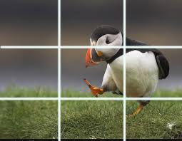
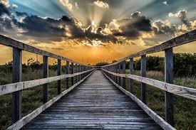
So far I have learnt different camera angles to help capture the image for example long shot, mid shot, close up, extreme close up etc. I also learnt different types of capturing an image on camera for example depth of field which only focuses on the subject or the background. The part that is not focused will be blurred. Rule of thirds are used to line up the eyes of a subject or an object in a picture. The eyes are normally in line with the top line.
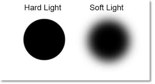
we also learned about lighting can be used in different ways such as soft light, hard light, high key, low key lighting. lighting can be synthetic or natural. visual lead ins, visual lead lines is your eyes following into an image, it can be the edge of something or the horizon.
This has helped me develop my skills on photography to produce good images.

This has helped me develop my skills on photography to produce good images.
Friday 2 October 2015
Tuesday 22 September 2015
School Magazine mastheads overview

Masterheads
These school mastheads all relate to school as "school" is in each title. The bottom title is from an actual school called Craigholme school. The design is that the logo is on the left and the logo represents the school and the name is in capitals. The font is normal and it stands out well from the background. The strapline is below the name creating effect to anyone who reads the title. It helps them promote their school.
The top left is from a "Back to school" magazine. The name is designed to make the title creative and that it attracts the reader. As the Craigholme school title, The name is in caps and the colours used makes it stand out. Back and to is made green where school is pink to combine the title. There is no strapline.
Top right is from Independent school magazine and the title is in caps just like the other two titles. The title is more bold then the rest creating a bigger title for people see. There is a strapline below the Title and the colour is the same as the title to seperate from "parent". All three titles are designed in their own way to promote and attract their audiences.

Monday 21 September 2015
technologies Reviews
Tubechop
Tubechop allows you to take videos that u made or anyone else's to create a new video by cut it down to the interesting parts. After editing you can share them with friends. you find a video using the search engine then. my view is that it can be great for chopping vids and using them in your own but only the best bits.
Quizlet
Quizlet is a website where students and teachers can go on to set work or revision to help students learn. Once on you can create a class with friends or create a study set for people to use. People can play games by matching up the definition with the keyword typing the keyword with the definition or cards with have both to look at. My view is that Quizlet is a great way to learn and can gain a lot of knowledge from using it.
Dipity
This software can create interactive timelines where you can add photos to customise their set of flashcards. It can be shared with friends. This can be great for videos, images, audio, text, links, social media, location, timestamps. My view is that its great for making photo timelines of your life or an event plus it is free to use.
Pixlr
Pixlr is an a free online photo editing tool. Which means any photo can be edited to your liking. It can be downloaded as an app on your phone. you can use different colours shapes shaders etc to customise the photo. my view is that there is many different options u can choose from to customise. This is free to use which is great if you can't afford better software.
Sunday 20 September 2015

Thursday 17 September 2015
Music magazine front covers
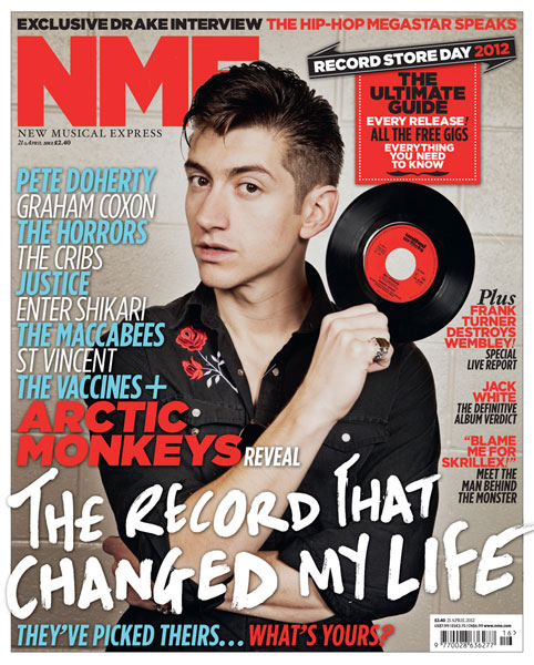
NME (New Musical Express)
- Title is initialed and is made large to show the title. The colour is red which makes it stand out from the rest of the cover.
- The strapline has a different text style and describes what the image is about.
- "The record that changed my life" links to the record that is he holding in his right hand. This makes the image more relevant to the main story.
- The anchorage and cover lines have a mixture of different fonts and colours. On the left hand side of the cover, the font colour is light blue and white. The names of musicians is coloured like this to make the cover more attractive to the target audience. On the right hand side, there are other storys which gets the reader interested. The story is coloured red and the add on to the story is coloured black to make it attractive.

Q
- The title Q is put into a red box and made white so it stands out from the cover as the name.
- The strapline is located at the bottom of the page as it talks about the musician in the music. Adele is made white to part the name from the what it is about. This attracts the reader more into the story.
- The most used font and colours is white and red as it blenders together well and makes the page attractive for there target audience.
- The main image shows Adele with her hair blowing to link to the the main strapline
- The anchorage is located on the left hand side and the colours is red with a bit of black to part from the rest of the cover
- The cover lines are on the right hand side to reveal a great deal about the titles ideologies.

Billboard
- The magazines title is at the top of the cover and is large to stand out. part of the image covers the title.
- The title is white to stand out from the red curtain background.
- The font and colours used are yellow and white and the most used is white.
- The strapline is at the bottom of the cover and its is large and white to grab the target audience. the name of the musician Taylor Swift is yellow and the description is white. It is larger then the name to show it is the main story.
- Taylor swift is dressed to be at a rewards ceremony which links to the theme of the magazine.

Kerrang
- The title is at the top of the cover and the colour of the font is white to make it stand out.
- The strapline has a font colour of white and the rest of the added story is put into black boxes to attract their audience.
- The main colours are White, red and black as it represents rock which is the theme of the magazine.
- Their are pap shots near the bottom left of the cover which represents reports or advertising.
- Most text on the front cover are in boxes.
Subscribe to:
Posts (Atom)