Tuesday 22 September 2015

School Magazine mastheads overview


Masterheads
These school mastheads all relate to school as "school" is in each title. The bottom title is from an actual school called Craigholme school. The design is that the logo is on the left and the logo represents the school and the name is in capitals. The font is normal and it stands out well from the background. The strapline is below the name creating effect to anyone who reads the title. It helps them promote their school.

The top left is from a "Back to school" magazine. The name is designed to make the title creative and that it attracts the reader. As the Craigholme school title, The name is in caps and the colours used makes it stand out. Back and to is made green where school is pink to combine the title. There is no strapline.

Top right is from Independent school magazine and the title is in caps just like the other two titles. The title is more bold then the rest creating a bigger title for people see. There is a strapline below the Title and the colour is the same as the title to seperate from "parent". All three titles are designed in their own way to promote and attract their audiences.

School magazine Analysis

James Dewar-Tomlinson 12CN

Monday 21 September 2015

technologies Reviews

Tubechop

Tubechop allows you to take videos that u made or anyone else's to create a new video by cut it down to the interesting parts. After editing you can share them with friends. you find a video using the search engine then. my view is that it can be great for chopping vids and using them in your own but only the best bits.


Quizlet

Quizlet is a website where students and teachers can go on to set work or revision to help students learn. Once on you can create a class with friends or create a study set for people to use. People can play games by matching up the definition with the keyword typing the keyword with the definition or cards with have both to look at. My view is that Quizlet is a great way to learn and can gain a lot of knowledge from using it.

Dipity

This software can create interactive timelines where you can add photos to customise their set of flashcards. It can be shared with friends. This can be great for videos, images, audio, text, links, social media, location, timestamps. My view is that its great for making photo timelines of your life or an event plus it is free to use.

Pixlr

Pixlr is an a free online photo editing tool. Which means any photo can be edited to your liking. It can be downloaded as an app on your phone. you can use different colours shapes shaders etc to customise the photo. my view is that there is many different options u can choose from to customise. This is free to use which is great if you can't afford better software.


Thursday 17 September 2015

Music magazine front covers


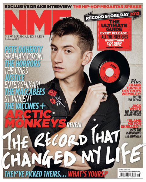
NME (New Musical Express)
  • Title is initialed and is made large to show the title. The colour is red which makes it stand out from the rest of the cover.
  • The strapline has a different text style and describes what the image is about. 
  • "The record that changed my life" links to the record that is he holding in his right hand. This makes the image more relevant to the main story.
  • The anchorage and cover lines have a mixture of different fonts and colours. On the left hand side of the cover, the font colour is light blue and white. The names of musicians is coloured like this to make the cover more attractive to the target audience. On the right hand side, there are other storys which gets the reader interested. The story is coloured red and the add on to the story is coloured black to make it attractive.


Q
  • The title Q is put into a red box and made white so it stands out from the cover as the name. 
  • The strapline is located at the bottom of the page as it talks about the musician in the music. Adele is made white to part the name from the what it is about. This attracts the reader more into the story. 
  • The most used font and colours is white and red as it  blenders together well and makes the page attractive for there target audience.
  • The main image shows Adele with her hair blowing to link to the the main strapline
  • The anchorage is located on the left hand side and the colours is red with a bit of black to part from the rest of the cover
  • The cover lines are on the right hand side to reveal a great deal about the titles ideologies.


Billboard
  • The magazines title is at the top of the cover and is large to stand out. part of the image covers the title.
  • The title is white to stand out from the red curtain background. 
  • The font and colours used are yellow and white and the most used is white. 
  • The strapline is at the bottom of the cover and its is large and white to grab the target audience. the name of the musician Taylor Swift is yellow and the description is white. It is larger then the name to show it is the main story. 
  • Taylor swift is dressed to be at a rewards ceremony which links to the theme of the magazine.
Kerrang

  • The title is at the top of the cover and the colour of the font is white to make it stand out.
  • The strapline has a font colour of white and the rest of the added story is put into black boxes to attract their audience.
  • The main colours are White, red and black as it represents rock which is the theme of the magazine.
  • Their are pap shots near the bottom left of the cover which represents reports or advertising. 
  • Most text on the front cover are in boxes.