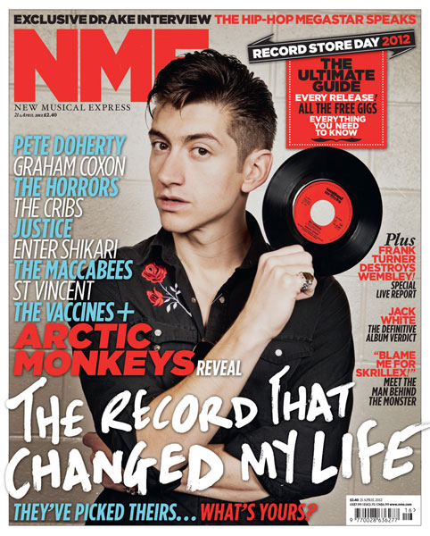
NME (New Musical Express)
- Title is initialed and is made large to show the title. The colour is red which makes it stand out from the rest of the cover.
- The strapline has a different text style and describes what the image is about.
- "The record that changed my life" links to the record that is he holding in his right hand. This makes the image more relevant to the main story.
- The anchorage and cover lines have a mixture of different fonts and colours. On the left hand side of the cover, the font colour is light blue and white. The names of musicians is coloured like this to make the cover more attractive to the target audience. On the right hand side, there are other storys which gets the reader interested. The story is coloured red and the add on to the story is coloured black to make it attractive.

Q
- The title Q is put into a red box and made white so it stands out from the cover as the name.
- The strapline is located at the bottom of the page as it talks about the musician in the music. Adele is made white to part the name from the what it is about. This attracts the reader more into the story.
- The most used font and colours is white and red as it blenders together well and makes the page attractive for there target audience.
- The main image shows Adele with her hair blowing to link to the the main strapline
- The anchorage is located on the left hand side and the colours is red with a bit of black to part from the rest of the cover
- The cover lines are on the right hand side to reveal a great deal about the titles ideologies.

Billboard
- The magazines title is at the top of the cover and is large to stand out. part of the image covers the title.
- The title is white to stand out from the red curtain background.
- The font and colours used are yellow and white and the most used is white.
- The strapline is at the bottom of the cover and its is large and white to grab the target audience. the name of the musician Taylor Swift is yellow and the description is white. It is larger then the name to show it is the main story.
- Taylor swift is dressed to be at a rewards ceremony which links to the theme of the magazine.

Kerrang
- The title is at the top of the cover and the colour of the font is white to make it stand out.
- The strapline has a font colour of white and the rest of the added story is put into black boxes to attract their audience.
- The main colours are White, red and black as it represents rock which is the theme of the magazine.
- Their are pap shots near the bottom left of the cover which represents reports or advertising.
- Most text on the front cover are in boxes.
No comments:
Post a Comment