Tuesday 3 May 2016

Q4. who would be the audience for your media product?

Q.4 Who would be the audience for your media product?

My magazine is called "Pop Era"and my target audience I aimed this at teenagers ranging from 16 to young adults. The reason for this is the models on the front are young meaning it will attract a larger audience. My audience will be in school but could be in higher education as well. For young adults they will be in full time jobs and possibly have little time to read magazines. The price for my magazine is £2.00 which is reasonable with most magazines in the music industry. This makes it affordable and not too expensive for my audience. If it was it would not attract my audience as it would cost too much.


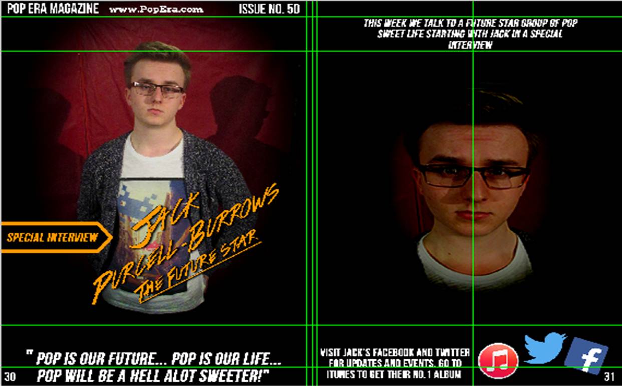
Technologies help bring in audiences as social media and websites can advertise my product.. My target audience have mobile phones like Iphones, Sony or Nokia that has apps, a camera, messaging and social media which young people will use the most. In my magazine I included a web link and multiple social media sites. For example Facebook, Twitter and as it is a music magazine Itunes would be most used app to download music which I used to promote my main headline. The benefit of this is that people can download on different platforms not just on mobile phones like a laptop. To see these advertisements my target audience can find it on the front cover and the double page spread. 


JICNAR SCALE 
Group A (Professionals)
Upper middle class, e.g. Barristers, Doctors, Executives

Group B (Managerial)
Middle class, e.g. Bank Managers, Teachers

Group C1 (Non-Manual)
Lower middle class, white collar workers, e.g. Office Workers

Group C2 (Manual)
Skilled working class, Blue collar workers, e.g. Car Mechanic, Machine operators, Construction workers

Group D (Partly Skilled)
Semi or unskilled manual workers, e.g. Assembly line worker

Group E (Unskilled)
Casual workers, dependent on state benefits, students

As my audience is in their teens their would be in class E as they are students in the JICNAR scale. This means that they will be living at home and mostly funded by their parents/Guardians. They will be in group A,B or C1. As my secondary audience, it ranges from young adults at 20 to 30 to adults 30 and over. These people could be older siblings to friends.  Instead of using real artists and then having models re-create them, so I thought I could make up a group and a individual artist to try and attract my target audience. The group name was "Sweet Life" and the individual was me. However in the magazine I mentioned real artists and groups to attract other audiences that are behind them. 

Monday 2 May 2016

Q3. what kind of media institution might distribute your media product and why?

Bauer media group


European based media company headquartered in Hamburg, Germany that manages a portfolio of more than 600 magazines, over 400 digital products and 50 radio and TV stations around the world. The portfolio includes print shops, postal distribution and marketing services.

Music publications
Q Magazine
Q started out as a music magazine published monthly in the United Kingdom. However it was originally called Cue but it had to changed as it got confusing with snooker magazines. It has expanded to Radio and Tv as music entertainment that specialises in indie, rock and alternative. Q also holds annual music awards in the UK known as the Q awards. 

Kerrang Magazine
Kerrang is a brand that specialises in rock music. It originally began as a magazine and in 2004 Kerrang radio was launched.  A Kerrang TV channel also exists.  It is UK based magazine that is devoted to rock music. It was first published on 6th June 1981as a one off supplyment in the sounds newspaper.
Mojo Magazine
Mojo is a popular music magazine published initially by Emap, and since January 2008 by Bauer, monthly in the magazine. Following the success of the magazine Q, publishers Emap were looking for a title that would cater for the burgeoning interest in classic rock music. Mojo was first published on 15th October 1993 in keeping with its classic rock aesthetic, the first issue had Bob Dylan and John Lennon.

This could be where I distribute my product as It has well known magazines like Q which are related to pop. Their portfolio includes marketing services meaning I can market my product effectively using different strategies.  They have a good reputation and is one of the most recognised company and brand. As my magazine is called "Pop Era" I think the company might want to take my product and distribute it alongside Q magazine. People would read it to see if they want buy it after looking at all the content. However doing this, people might want to go back to Q magazine as it's more popular even though my name is quite rememberable and interesting just like Q. Though overtime I think my magazine will get popular and be interested by a wide range of audiences covering all areas of pop. 

Thursday 14 April 2016

Final Double page spread


Double page spread 2 development


This is my second Double page spread which I decided to work on along with my first one. For this spread I added guidelines to the middle where it will fold so that I can move my images and text in the space so that it doesn't overlap. I added guidelines at the top, one for the name of the magazine and for the issue number and the other for the title on the second page. The font for this wad Bebus Neue and was size 64 and 125. The title is coloured gold to seperate it self from the white text and the background. The colour is the same for the name of the artist as it is the main headline. I angled it so that it maximizes the space but leave enough room for the picture to be visible. I also added effects to create a drop shadow so that it stands out of the page. The quote is below the picture as it links with the picture but leaves the headline in the middle to be clearly visible. I used guidelines to fit it in perfectly. I edited the picture so that it creates a black circle border around my model which is a little faded around the edges to create like a spotlight effect on my model. This will blend perfectly with the background as it continues the effect. It is the same with the other picture but the picture has been changed of it's brightness and contrast. I darkened the picture so it goes into the background but clear enough that the text on top will be clearly visible with the picture behind. Finally in the bottom corners I added page numbers that I coded on the contents page starting with 30 to 31.


I added a few more features to the page to make it more attractive for the audience. I added on the second page social media logos to help promote my model. I added a twitter, Facebook and iTunes logos as these are top web and app social medias. Next to it is a message which promotes the social media sites. Also I moved the title that was on the second page and moved it to the side in a banner to bond with the headline. The headline is slightly adjusted and has a bit more text. It is adjusted a bit lower on the page and I added "The Future Star" underlined and small to fit with the name of the artist. As a result of this, the quote is lowered to the bottom of the page. At the top of the page I added the website link.


Double page spread 1 development


This is the start of my double page spread. The page will be about me and how I reached fame. For the page I split into 2 pages using guidelines then I used gutters to show where the page will be folded in the middle. The background is will be black and a image of me standing in a spotlight. This will go with the headline which will be on the left hand side of the page. The image will be on the right hand side of the page and represented as a white box. The text is located at the bottom of each page represent with white text. The text will size 13 and Bebas Neue font style. The house style is still the same with the colours being, white black and gold. This has continued from the front cover and the contents page. Both haven't got any added colours they have all been the same.


In this I have changed the headline design because the previous title didn't fit with the page so I changed the font from Bebas Neue to Colours of Autumn which looks better as the name "JAMES" is bold and tilted slightly creating affect for the reader. It is the same for "RISE TO FAME" which carries over the same style. The other bit of the title "HOW IT ALL BEGAN" is placed on the right hand side.


In this one I have added the name of the magazine and the issue number at the top left of the first page and I have also added two page numbers. One in the bottom left and one in the bottom right. left is 16 which is what I have put on the contents page so that it follows correctly and 17 for the next page along. The text on the right hand side has now been moved to the left side and compressed into a column same as the left side text. Finally I have added a location for the quote from the artist which is placed on top of the image of me in a spotlight. This adds more to the story.

Monday 29 February 2016

Contents page final design update


This what I have made so far for the contents page. In my design I continued to use the same colour scheme which I used on the front cover. The title is at 150 front size and underneath the title I added the date and website link to show the reader the date it was released but also advertise the website. On the right hand side of the page I added a issue number at the top of the page and next to it a picture of the front cover. I did this cause I thought I could use some of the ideas from existing magazines which I research before for example Q magazine has both issue number and the front cover on the same side of the page. The logo is next to the magazine on my contents page.


As you can see the front cover is next to the issue number which is smaller than most of the titles. Also on my contents page I have 4 locations for pictures which are a bigger font than the rest of the stories on the page. This would separate the big stories from less important stories. The number of pages are at the far sides of the magazine leaving space for the bigger stories that will have the images in the middle. The colour scheme will give the text some variety and importance as it symbolises what type they are. For example Gold is used for headings and Black for stories. The background colour sticks to the front cover as it borders are white so it fits to the style of the magazine. To get this together I used guidelines to accurately create a borders to help place these in the right position. Plus it can help me locate the middle of the page so I don't overlap the opposite side of the double page spread.


Thursday 25 February 2016

Front Cover for Pop Era

This is my final Front cover that I created from scratch.


Contents page research


These are some of the contents pages that I have found. As you can see most of the pictures and one page as it is more common in magazines than double page. However there some that are double spread and have more images and text than single as it has more space to include more images and text to show the reader whats included. The conventions of a contents page is that there is a title, use of images, uses a column structure, contents heading, page numbers, house style eg. colour font, layout, composition, captions- anchorage. Each Contents page has a picture of the main story which is on front cover to go with the issue. Some magazines have issue numbers at the top of the page instead of a title to show variety and to have the front cover next to it represent it. The House style is normal and it keeps the same colour scheme as the front cover. However it leaves the background plain white to show the text more clearly and give images more attraction instead of blending in to a dark background. The images are scattered in different issues providing more of a new attractive view for the reader. In these contents pages the text represented as stories are normally located on one side of the magazine providing room to fill in more stories and information.

Photo research

  • Shot type- medium close up
  • Angle- straight shot angle
  • Artist- Pharrell Williams
  • Effects- none
  • Turquoise background
  • Representations- Sunglasses and maybe a Sombrero 
  • Posture- looking straight at the camera no folding arms or any movement
  • Lighting- Low key, a shadow is created behind him to represent the sun and that its hot which links to his clothing.
  • Costume- Mexican theme possibly with the sombrero and the woolen jacket
  • Mode of address- Standing tall no movement just staring towards the camera which is direct. The camera could represent the audience.
  • Props- none


  • Shot type- long close up and left frame 
  • Angle- slightly high angle
  • Artist- Rihanna 
  • Effects- none
  • White background 
  • Representations
  • Posture- leaning to her right filling the left side of the photo
  • lighting- High key, no shadow is created behind her
  • Costume- black dress and has pick lipstick and blue eyeliner
  • Mode of Address- Direct to the camera even though she is learning 
  • Props- The blue Crystallized bird sitting on her shoulder


  • Shot types- long shot 
  • Angle- straight shot angle
  • Artist- Florence and the machine
  • Effects- none
  • White background
  • Set- standing in the middle of all the worlds famous landmarks from Big Ben to Eiffel tower to the Statue of liberty 
  • Representations
  • Posture- Arms on hips
  • Lighting- High key no shadow
  • Costume- quite revealing 
  • Mode of Address- Direct 
  • Props- none

  • Shot type- close up
  • Angle- straight angle shot 
  • Artist- Cheryl Cole 
  • Dark background 
  • Effects- Water coming from above on to Cheryl Cole to maybe represent rain
  • Representations
  • Posture- hand near mouth holding a metal object, tongue out to touch object.
  • Lighting- high key no shadow
  • Costume- Black leather jacket to go with dark theme, red lipstick and black eyeliner
  • Mode of Address- Direct at the Camera
  • Props- Metal object 


  • Shot type- medium shot 
  • Angle- Low angle
  • Artist- Muse
  • Space background 
  • Effects- none
  • Representations-
  • Posture- Standing tall (Middle) has his head slightly turned to his left where everyone else has there head straight.
  • Lighting- high key
  • Costume- Casual (right) has a necklace 
  • Mode of Address- (Middle) Direct at the camera (left and right) looks straight ahead away from the camera Indirect
  • Props- none