Saturday 30 April 2016
Friday 29 April 2016

Monday 25 April 2016

Thursday 14 April 2016

Double page spread 2 development

This is my second Double page spread which I decided to work on along with my first one. For this spread I added guidelines to the middle where it will fold so that I can move my images and text in the space so that it doesn't overlap. I added guidelines at the top, one for the name of the magazine and for the issue number and the other for the title on the second page. The font for this wad Bebus Neue and was size 64 and 125. The title is coloured gold to seperate it self from the white text and the background. The colour is the same for the name of the artist as it is the main headline. I angled it so that it maximizes the space but leave enough room for the picture to be visible. I also added effects to create a drop shadow so that it stands out of the page. The quote is below the picture as it links with the picture but leaves the headline in the middle to be clearly visible. I used guidelines to fit it in perfectly. I edited the picture so that it creates a black circle border around my model which is a little faded around the edges to create like a spotlight effect on my model. This will blend perfectly with the background as it continues the effect. It is the same with the other picture but the picture has been changed of it's brightness and contrast. I darkened the picture so it goes into the background but clear enough that the text on top will be clearly visible with the picture behind. Finally in the bottom corners I added page numbers that I coded on the contents page starting with 30 to 31.
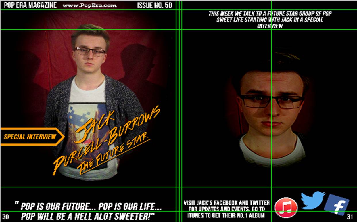
I added a few more features to the page to make it more attractive for the audience. I added on the second page social media logos to help promote my model. I added a twitter, Facebook and iTunes logos as these are top web and app social medias. Next to it is a message which promotes the social media sites. Also I moved the title that was on the second page and moved it to the side in a banner to bond with the headline. The headline is slightly adjusted and has a bit more text. It is adjusted a bit lower on the page and I added "The Future Star" underlined and small to fit with the name of the artist. As a result of this, the quote is lowered to the bottom of the page. At the top of the page I added the website link.
Double page spread 1 development

This is the start of my double page spread. The page will be about me and how I reached fame. For the page I split into 2 pages using guidelines then I used gutters to show where the page will be folded in the middle. The background is will be black and a image of me standing in a spotlight. This will go with the headline which will be on the left hand side of the page. The image will be on the right hand side of the page and represented as a white box. The text is located at the bottom of each page represent with white text. The text will size 13 and Bebas Neue font style. The house style is still the same with the colours being, white black and gold. This has continued from the front cover and the contents page. Both haven't got any added colours they have all been the same.

In this I have changed the headline design because the previous title didn't fit with the page so I changed the font from Bebas Neue to Colours of Autumn which looks better as the name "JAMES" is bold and tilted slightly creating affect for the reader. It is the same for "RISE TO FAME" which carries over the same style. The other bit of the title "HOW IT ALL BEGAN" is placed on the right hand side.

In this one I have added the name of the magazine and the issue number at the top left of the first page and I have also added two page numbers. One in the bottom left and one in the bottom right. left is 16 which is what I have put on the contents page so that it follows correctly and 17 for the next page along. The text on the right hand side has now been moved to the left side and compressed into a column same as the left side text. Finally I have added a location for the quote from the artist which is placed on top of the image of me in a spotlight. This adds more to the story.
Subscribe to:
Posts (Atom)